Problem
There were a few challenges with KickUp’s color system:
- It’s often unclear for developers when to use a specific color
- There was only a gray color scale, no scales for other colors.
- The token naming conventions did not support theming
- Color contrast is not guaranteed between text and background colors
Solution
Color scales with guaranteed color contrast
To address most of the challenges above, we first needed to lay a solid foundation: color scales. Color scales would be the most basic tokens of the color system and would be aliased by other utility color tokens.
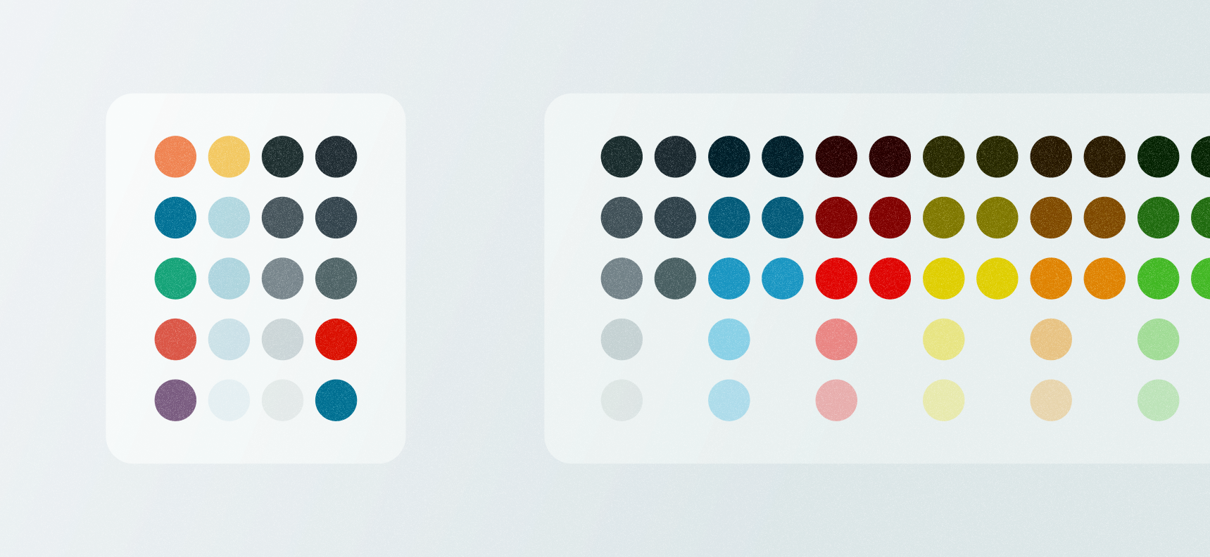
There was already a color scale for grays, but without scales for the rest of the colors, engineers were heavily relying on color utilities to lighten, darken, or transparentize colors at runtime. Having color scales for all colors would bring consistency across all of the palettes, give designers more choices, give the product a flexible set of colors to use in data visualizations, and remove the need for color utilities.
An example of the less-than-ideal dev experience of lightening a colorimport { lightenColor } from 'ComponentLibrary/utils';...<divcss={`background: $({ theme }) => lightenColor(theme.colors.blue, 0.2)};`}>
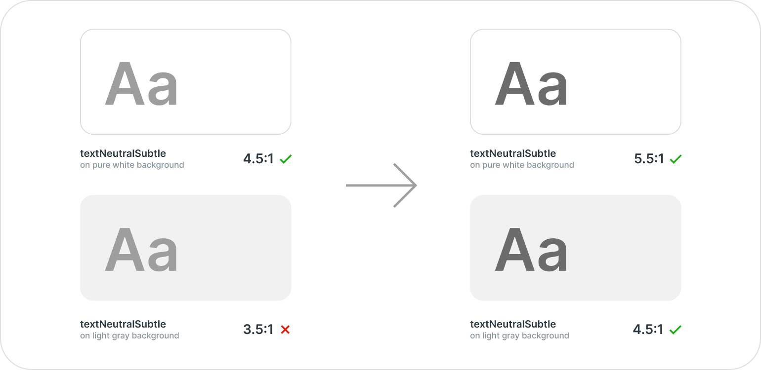
To create the color scales, I first used an online tool called Leonardo Color. By entering a background color, a key color, and a list of contrast ratios, it outputs a scale of colors that includes the key color and has stops at each contrast ratio (the ratio being relative to the background color). So, I made a spreadsheet of contrast ratios and noted ratios for muted and regular background colors, text colors, and icon colors. With specific stops for these, I could predictably use a foreground color of a certain number (eg. gray900) on top of a background color with a certain number (eg. gray100).
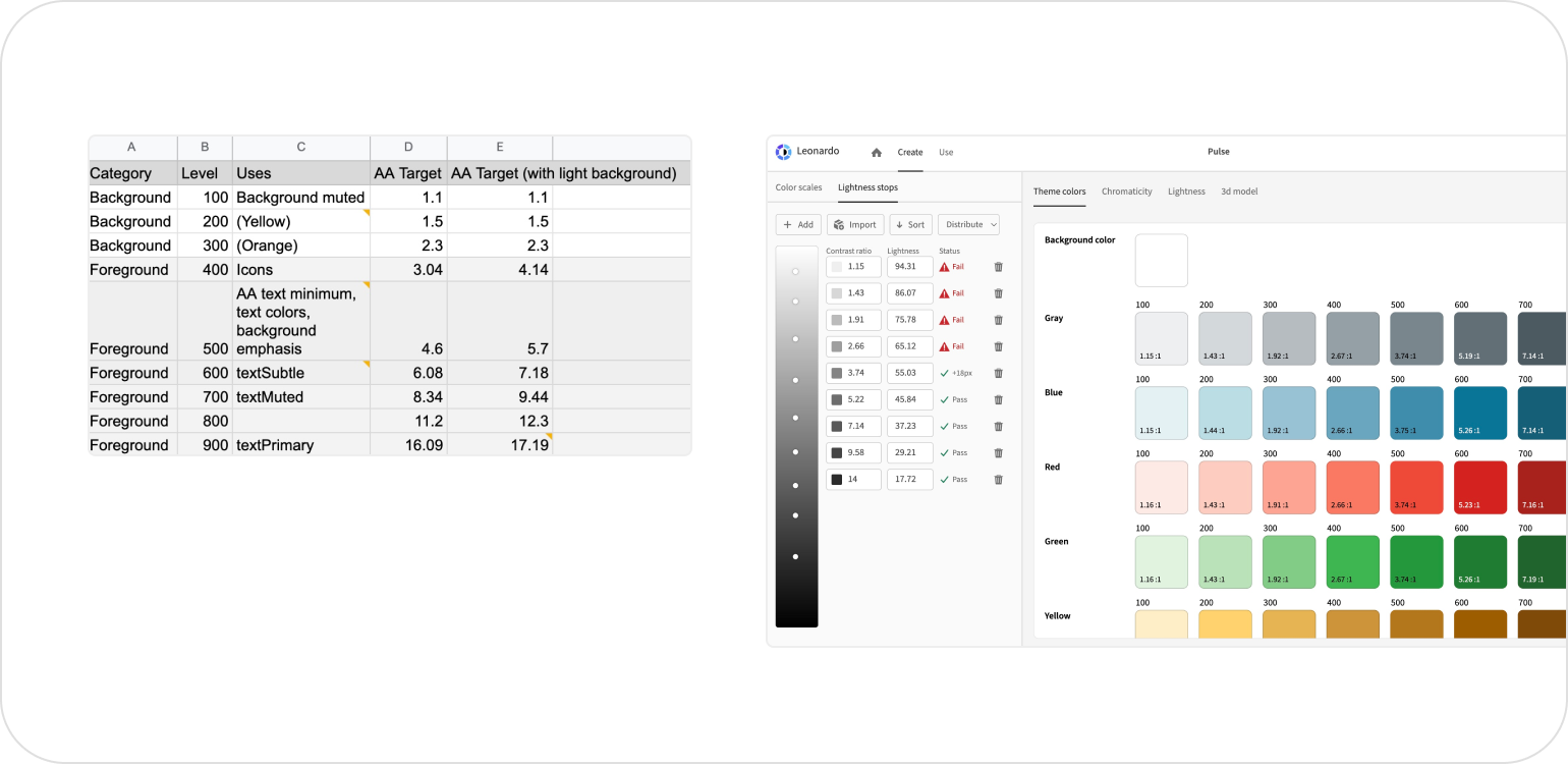
While it would be simplest to check text colors against the base background color used by Leonardo, I wanted the ability to use colorful text on colorful backgrounds. So, rather than having the lightest possible text color have a contrast ratio of 4.5:1, I made it 5.6:1, so that I could put the text on a colorful background that had a contrast rating of 1.1:1. This ensured that the text color used on the background color was still at least 4.5:1.
This was the key to guaranteed contrast. From this scale, I could predictably alias the background, text, and icon colors, so that using any text token would have sufficient contrast on any light background color (or pure white background color).
In addition to light background colors, I also wanted darker/solid background colors for things like buttons. For most colors, I could safely use a contrast level of 4.5:1, since that’s the ratio relative to white and I’d be putting white text on the buttons, mostly. The outlier is yellow. Since yellow is a very light color by default, you can’t put white text on it. You could use the 4.5:1 step of the yellow color scale but it no longer looks like yellow. To solve this, I ultimately created a text color token for each color palette called textOnBackground{color}. This is a text color that can safely be used on any default solid color background.
A clearer choice for developers
Utility colors
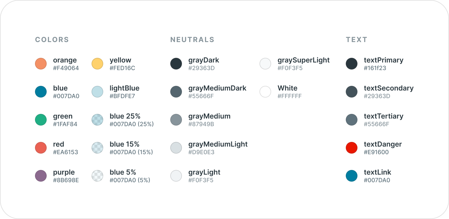
One of the core benefits of the color scales described above is that it allows for consistent aliasing to create utility colors. Utility colors (colors specifically for backgrounds, text, icons, borders, hover states, etc) make color identification far easier during implementation. If there’s a gray icon in a design, rather than trying to pick between grayMediumLight, grayMedium, or grayMediumDark, you can now choose the token made specifically for that element and color palette iconGray.
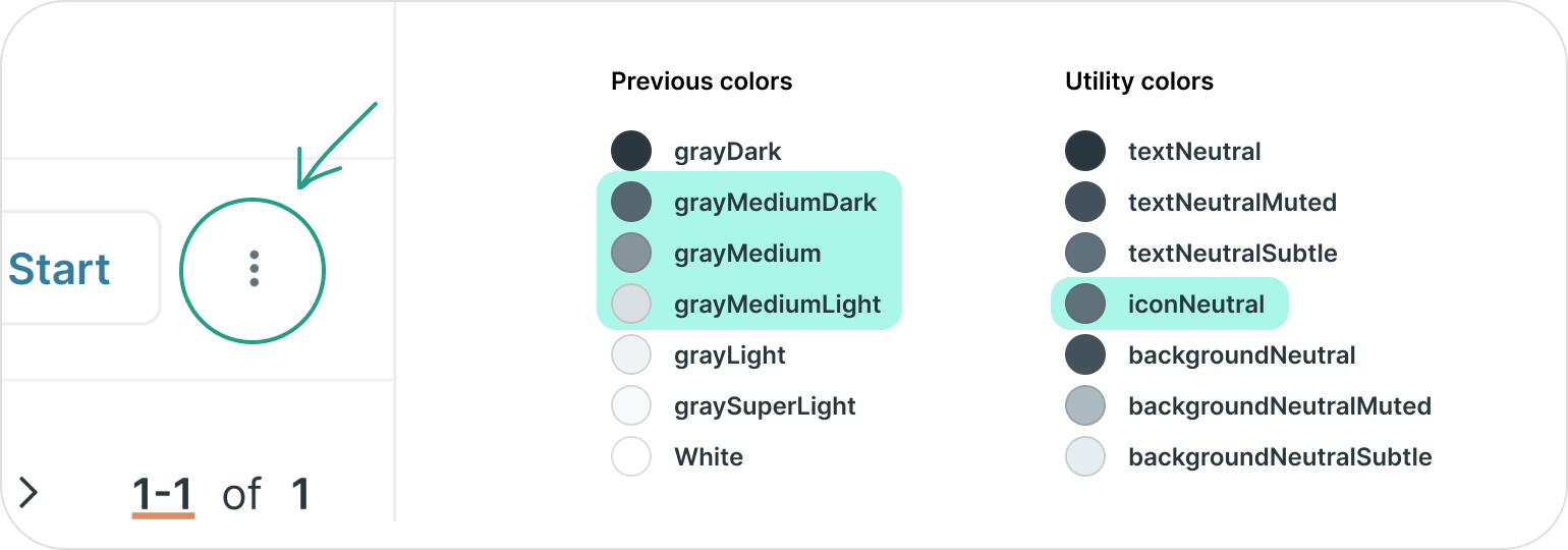
Note: an alternative here is just allowing engineers to select a scale color and requiring that they remember that a 700 color is safe to use on a 200 color. I chose not to go with this approach to avoid engineers needing to remember specific numbers. Also, since they’d be remembering the color scale tokens directly, it would make it more difficult to change and tweak those over time.
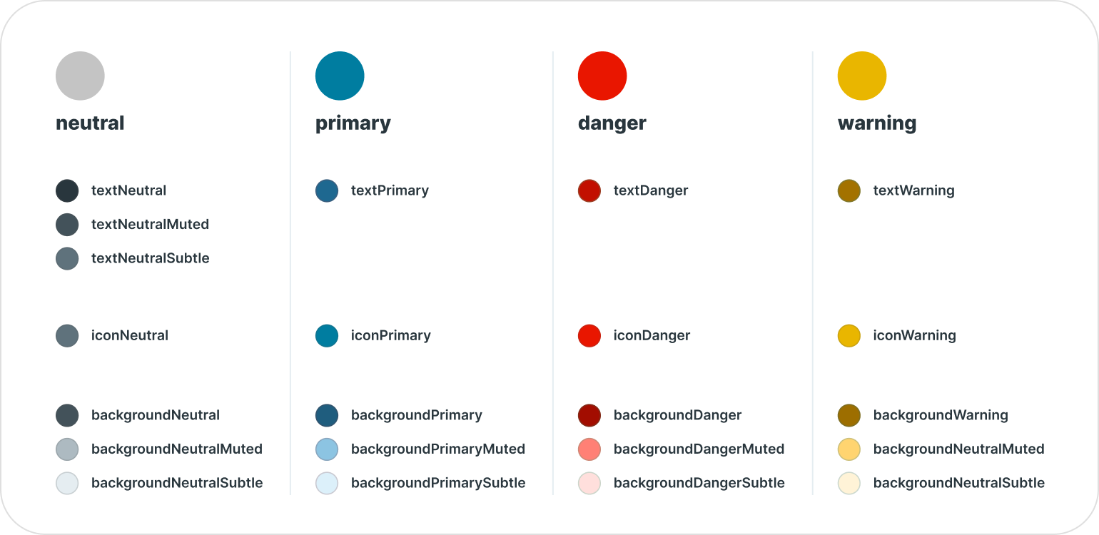
Semantic colors
Semantically-named colors tap into some of the psychology behind color. Reinforcing dangerous actions with red, successful actions with green, or neutral actions with gray are all ways of reinforcing the message of the UI with color. By naming tokens semantically, you embed the purpose of a UI in the colors that make up that UI. It’s essentially a color token with its own documentation. textDanger should be used when there’s something wrong. textSuccess should be used when something was successful. No need for documentation. The colors explain themselves.
The finalized semantic color palette names were the result of many conversations with the engineering team. I met with every engineer on the team, explained the system, and asked for feedback. The feedback was overwhelmingly good and people were excited for the consistency these semantic concepts would bring to the color system.
Component props
In addition to using the semantic palette names in the tokens, it seemed important to carry this naming convention to our component library components. If there are primary, danger, and success text colors, it seems intuitive to have primary, danger, and success buttons. So, to lean into the semantic naming even further, I decided to update the color prop interface for all componentLibrary components (Buttons, Badges, Messages, Icons, etc.) to accept a semantic color name.
Since the color name passed in has related color tokens with the same name, it makes composing the desired color tokens extremely easy and allows us to automatically support all color palettes all at once.
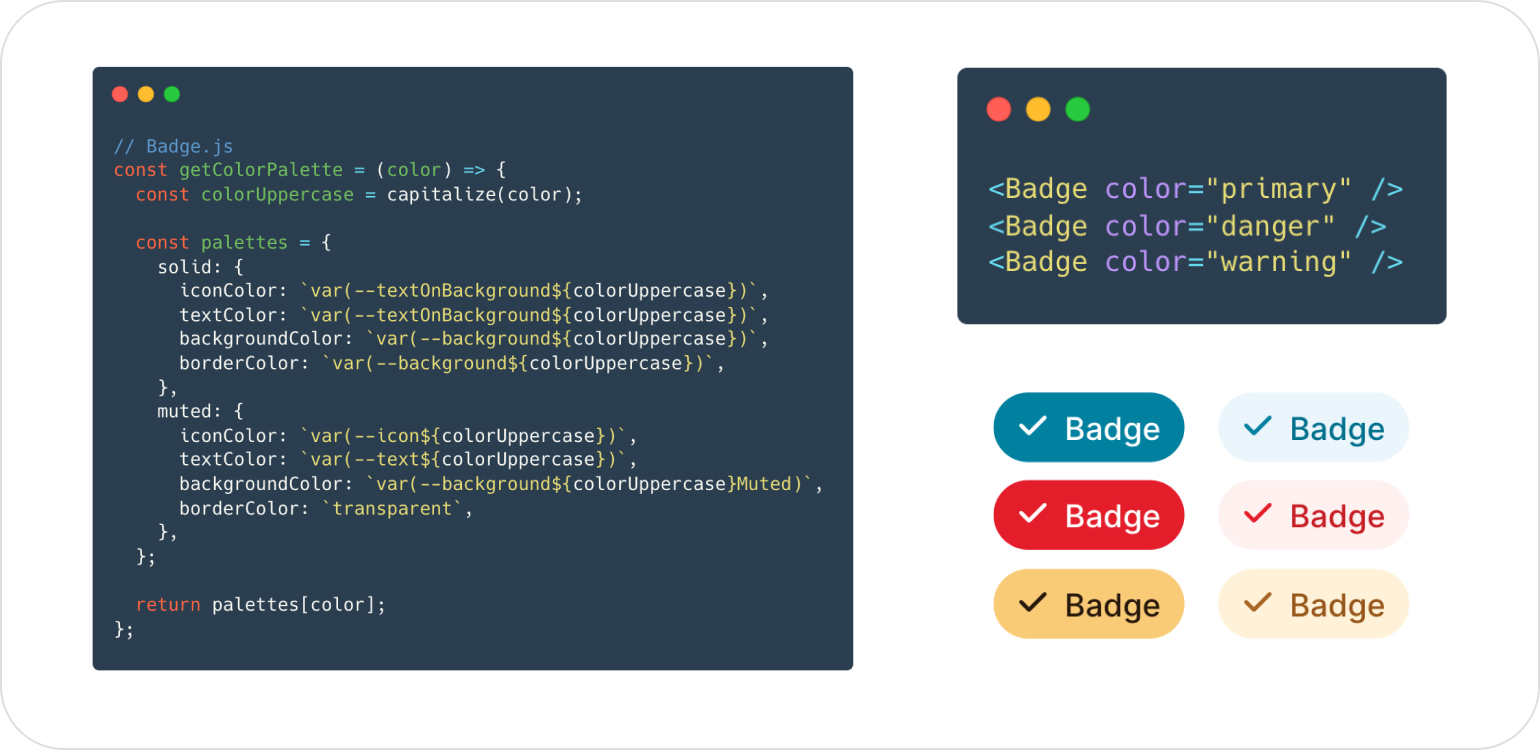
Updating the color prop of components to accept the name of a semantic color palette broadens the use of semantic colors to the entire componentLibrary, beyond just color token names, making the use of color more consistent.
Theme support
While our current tech stack doesn’t easily support themes due to a large amount of static .less files, it was important that this color system could support themes. This way, if we change how we use and represent colors in the future (using css variables), our color system wouldn’t be holding us back. This is one of the reasons for utility colors and not directly referencing scale colors. It’s also the reason why we used naming conventions like muted and emphasis rather than light and dark.
Since the color scales were creating using Leonardo and we used white as the background colors, supporting dark mode is as easy as switching the background color to black, which will generate a new set of color scales with contrast ratios relative to black.
The final result
With all of the considerations and aspects of this project, KickUp now has a color system that guarantees color contrast and has way more consistency across color palettes. Text, icon, and background colors are semantically named which makes identifying and using colors incredibly easy. With multiple layers of abstraction above the color scales and consistent semantic color props in components, the dev experience is much simpler. And if there’s ever a need to implement a new component or go digging into the internals of component library components, you can find the consistent naming pattern of the new tokens.